


FIGURING THINGS OUT
I had the privilege of collaborating with Wil Brown, a renowned London movement coach, on an exciting project. Wil needed a brand refresh and a captivating website for the launch of his upcoming podcast.
Having previously worked on his community website (London Movement Group), I was thrilled to be chosen again based on my reputation for precision, attention to detail, and genuine care for my work.
This project presented an opportunity to showcase my expertise and deliver a remarkable solution that aligns with Wil's vision.
001 Moodboard
002 Exploration
003 Photography
004 Branding Guidelines
005 User-flow / Funnel
005 Web Design
Figma | Ai | Lrc | Ps | Sqsp

001 MOOBOARD
The creative journey began with a meticulously crafted moodboard, which played a pivotal role in guiding the project.
Through collaborative efforts, Wil and I established a shared vision by uploading and reviewing content together.
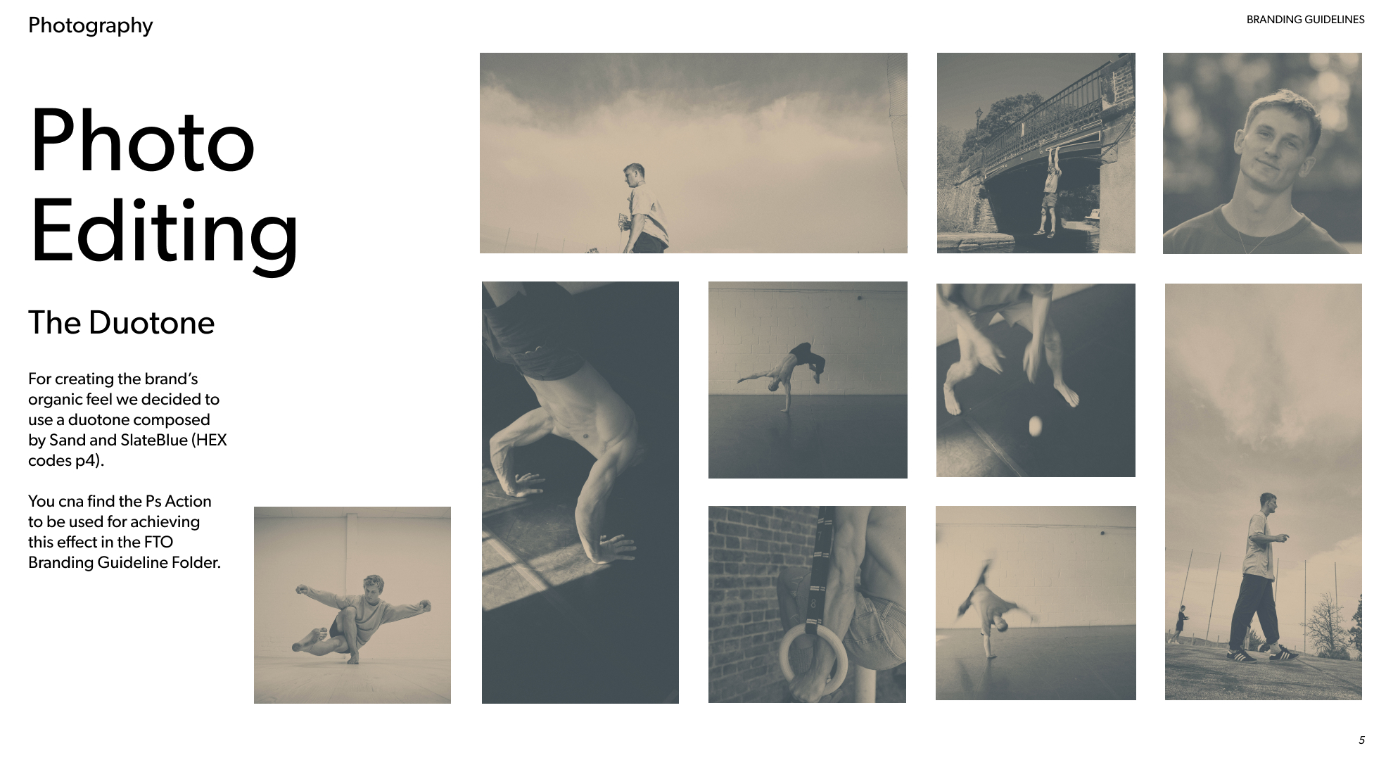
The moodboard reflected bold typography, overlapping images, and captivating copy placed strategically over photos. To enhance readability and evoke an organic feel, I proposed a stunning duotone effect as the base for photo editing, setting the stage for a visually impactful brand.


002 EXPLORATION
Diving into the exploration phase, I immersed myself in an array of font pairings, color palettes, and layout options. Four distinct drafts were meticulously developed and presented to Wil. One particular draft, featuring a sand and slate blue duotone dragonsquat photo, resonated deeply with him, serving as the foundation for both the branding guidelines and the web design. Furthermore, I expertly incorporated Wil's desired blue-green color, elevating the podcast's branding with a touch of uniqueness.
003 PHOTOGRAPHY
With a keen eye for detail, I made strategic photography decisions to infuse elegance and authenticity into the brand.
The captivating sand-slate blue duotone effect was skillfully applied, elevating the visual appeal with a touch of dreaminess. Blurred images were thoughtfully integrated to evoke a sense of movement, perfectly complementing Wil's expertise as a movement coach.
The duotone style, coupled with subtle noise, ensured optimal content readability when placed above specific areas of the photos.
.jpg)
.jpg)
.jpg)
.jpg)
.jpg)
.jpg)
.jpg)


004 BRANDING GUIDELINES
I crafted comprehensive branding guidelines that lay the foundation for a consistent and cohesive visual identity. The guidelines covered every aspect, including logo usage, typography, color palettes, photo editing, web design, and social media. This meticulous approach ensures that Wil's brand remains recognizable, resonates with his audience, and exudes authenticity.
005 USER-FLOW / FUNNEL
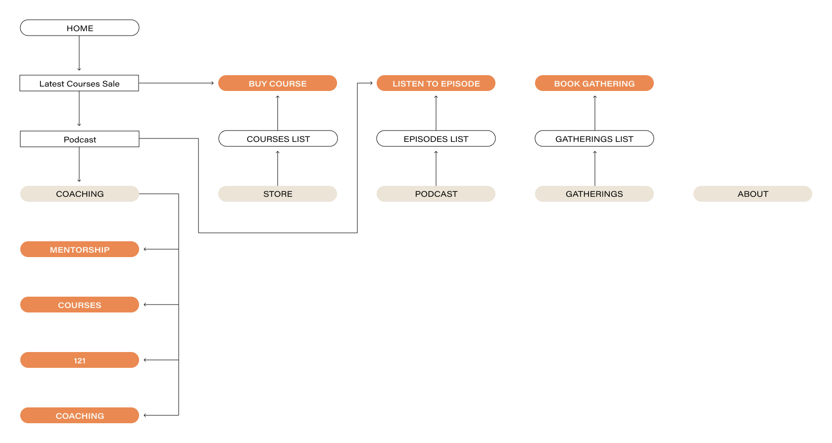
Understanding the significance of user experience, I diligently mapped out a seamless user-flow and funnel to guide visitors towards conversion points. Whether they start from the Home page or social media campaigns, the user journey is optimized for conversion.
In sand, the nav bar pages, in orange the CTA.

006 WEB DESIGN
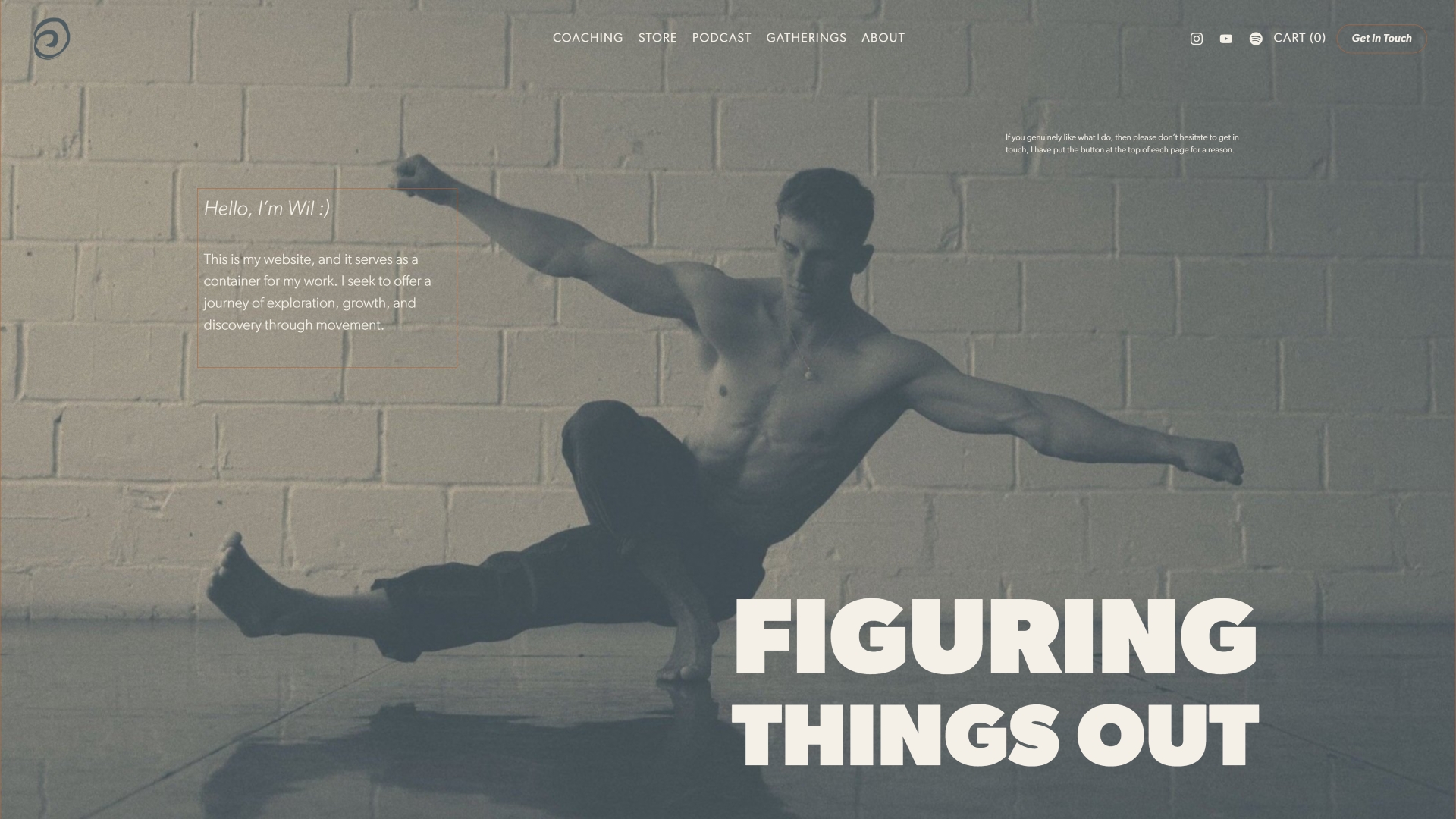
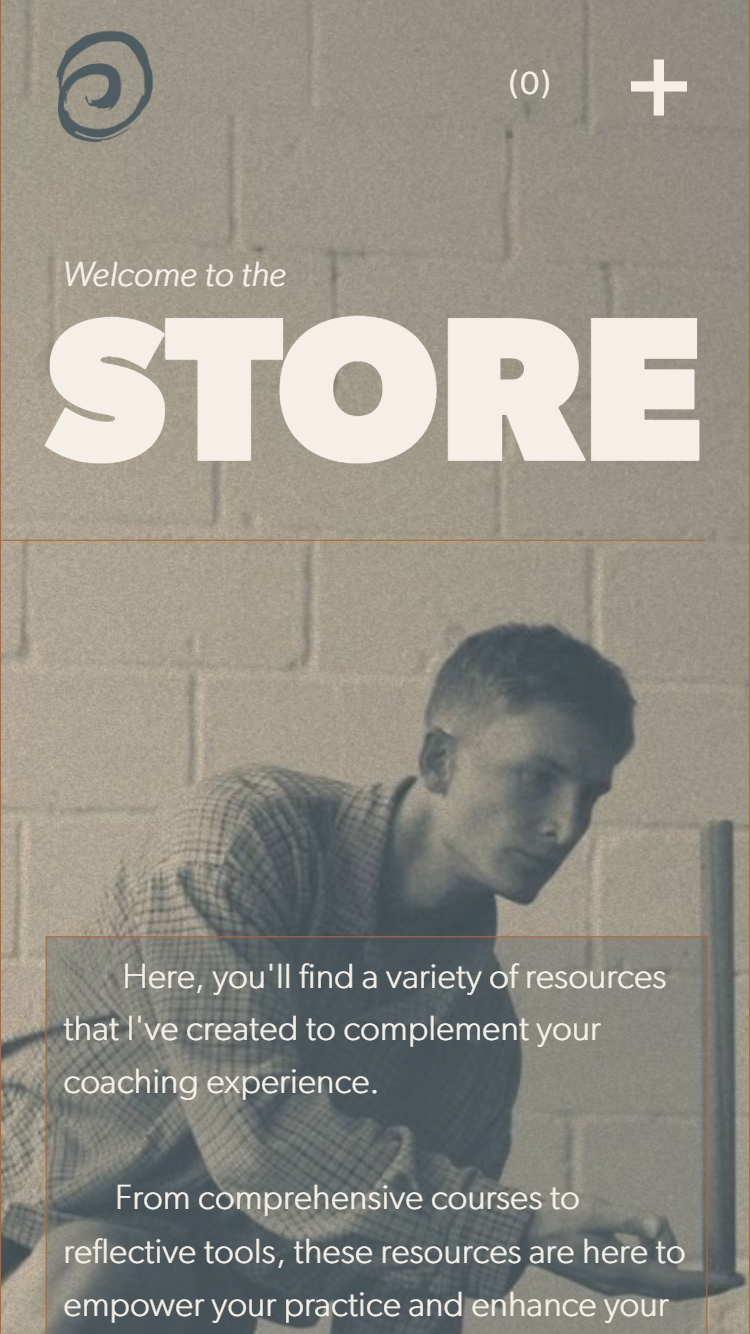
Building the website on Squarespace, a platform familiar to Wil, allowed me to create a design that encouraged exploration and discovery, mimicking the essence of movement practices.
The 4-column grid layout, enriched with strategically scattered elements, keeps the design engaging and invites curiosity.
Purposeful construction lines guide the reader's focus, fostering a sense of clarity and understanding of the design process.


007 SOCIALS
To effectively promote Wil Brown's upcoming podcast, I designed a series of captivating social media templates that would resonate with his audience. Drawing inspiration from the duotone photos used on the website, I strategically zoomed into specific areas, creating visually striking focal points.
By incorporating a unique petrol color, I established a clear and cohesive identity for the podcast, ensuring its recognition across social media platforms.
A few other templates were designed tobe incorporated with social posts not related to the podcast.
.jpg)
.jpg)
.jpg)
.jpg)
.jpg)
.jpg)
.jpg)
.jpg)